Article · Visual language
Making Dashboards Engaging and Actionable with Live Illustrations
At Rubrik, we approach dashboards as storytelling tools — crafting visuals that provide clarity, communicate complexity intuitively, and inspire meaningful action.
Overview
Dashboards are broken.
They fail to deliver.
They drown users in data.
We’ve all heard these frustrations from people across the tech industry. And honestly, they’re not entirely wrong. In the world of enterprise software, dashboards are everywhere, designed to facilitate discovery, monitoring, and insight gathering. Yet very few actually deliver. Some look pretty but struggle to provide meaningful insights; others are data dumps trying to please all types of users at once. Many fall short on actionability, and most fail to tell a cohesive story that meaningfully contextualizes the product experience for users.
At Rubrik, we approach dashboards as storytelling tools, crafting visuals that instantly provide clarity, communicate complexity intuitively, and inspire meaningful action. So how do we do this?
Approach
One way is through live interactive illustrations.
Enterprise products like Rubrik are inherently complex, and traditional dashboards often turn powerful capabilities into confusing black boxes. Live illustrations help break down these complexities, visually connect product capabilities, and guide users toward clarity and action, all while adding personality and delight to the user experience.
By transforming static data into engaging animations, these illustrations help users absorb insights, understand the product’s full value, and take meaningful action. Here’s what that looks like in practice.
In practice
Data Threat Analytics Summary
The hero widget of Rubrik’s Data Threat Analytics dashboard offers users a high-level overview of the customer’s threat environment, surfacing new threats and anomalies detected in the system.
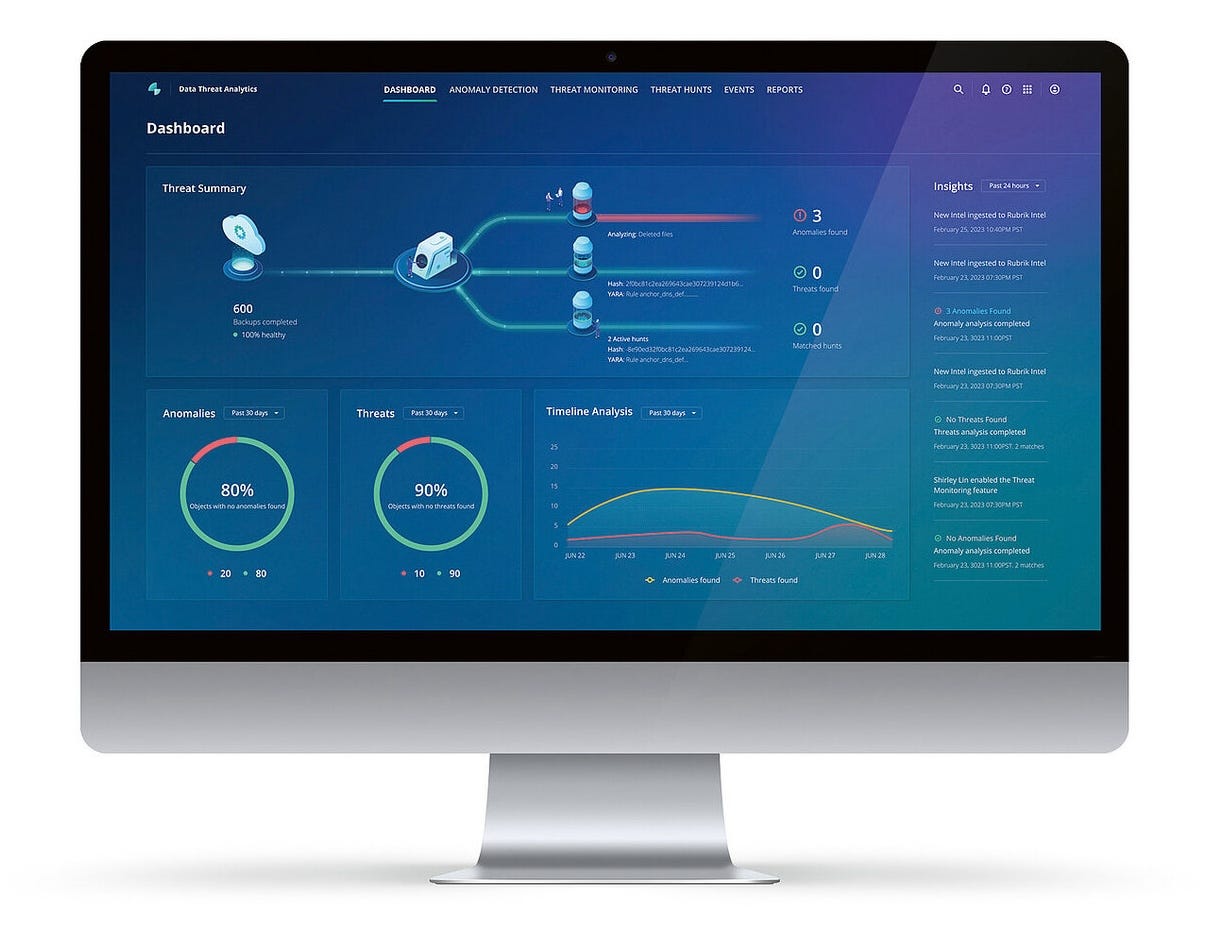
Since real threats are rare, the scanning animation reassures users that Rubrik is actively monitoring for threats 24/7, providing a sense of the system continuously at work, reducing the need for manual checks.
The illustration also ties together different features within the Data Threat Analytics app, providing an intuitive, cohesive visual that enhances feature visibility and highlights the interconnectedness of these capabilities.
Data Security Posture Overview
The Overview on the DSPM dashboard clearly shows users what portion of their data is enabled for security scanning, how much sensitive data is identified from that scanned data, and the amount of sensitive data flagged for security violations. Previously, these metrics appeared as three disconnected widgets. The new unified view provides users with an intuitive animation that conveys an end-to-end story of a working system.
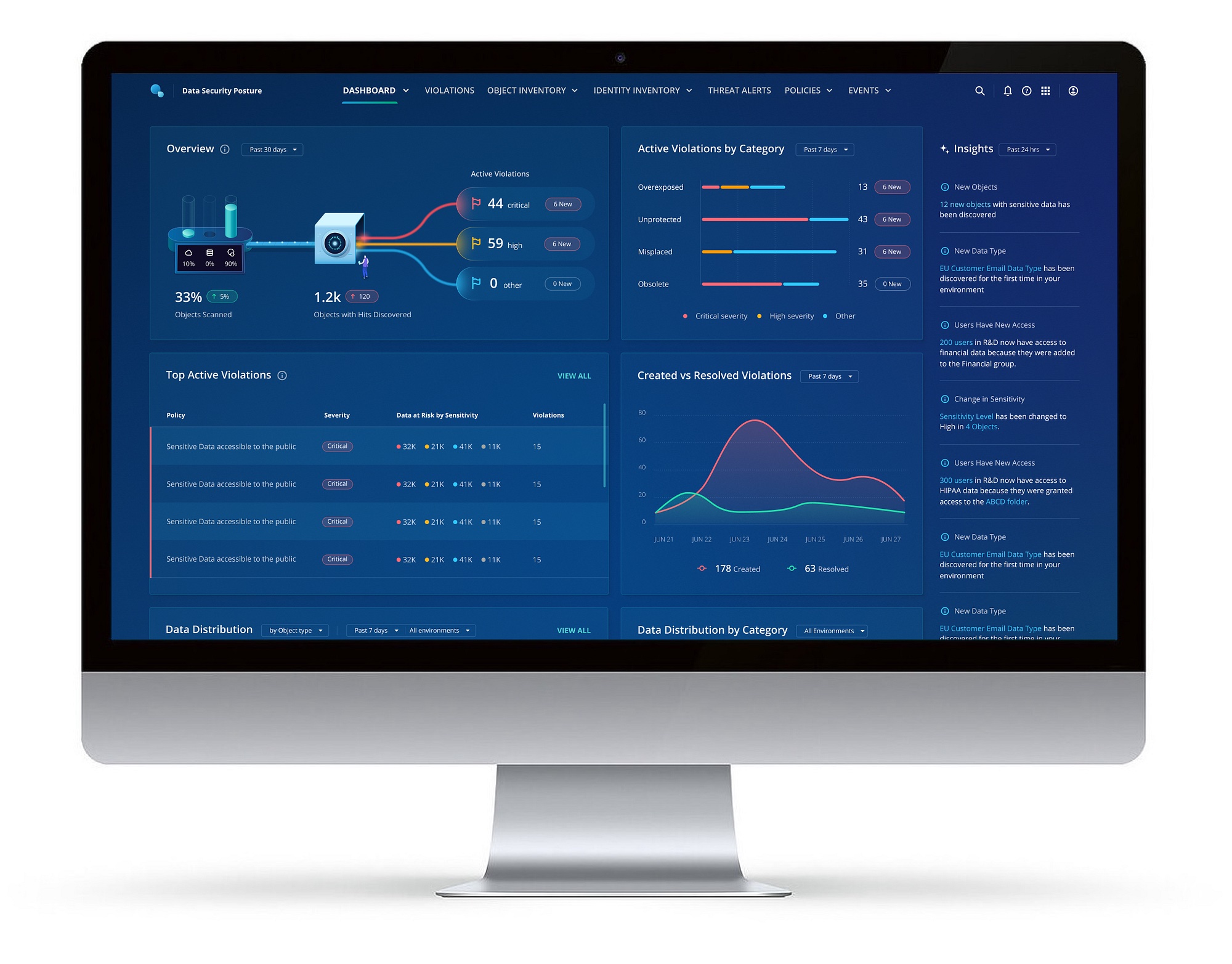
This visual clearly demonstrates how core capabilities — like sensitive data discovery and violation scanning — connect and interact, instantly surfacing any new violations that require attention. It also emphasizes why enabling scanning is essential for achieving full visibility into your overall data security health.
Impact
Feedback on these illustrations has highlighted their real value for users; as one customer said:
“I love these kinds of visuals because they offer so much context. They show me exactly how my environment is set up, how Rubrik’s system performs classification, and the insights it provides. It’s like watching a data flow diagram in action.”
Learnings
Inspired to give live illustrations a try? Here’s what we’ve learned along the way.
- Simplify Complex Systems: Use visuals to make complicated processes clear and actionable. For example, a scanning animation in the Data Threat Analytics Summary reassures users that Rubrik is working 24/7, providing peace of mind even when no threats appear.
- Connect Visuals to Actions: Ensure illustrations guide users toward their next steps and show how different features interact. The DSPM overview demonstrates how enabling sensitive data scanning unlocks deeper insights and highlights security violations, prompting action.
- Encourage Exploration: Make visuals that drive engagement and exploration. Transform data-heavy sections into animated components, encouraging users to interact with the dashboard and turn passive data into active decision-making tools.
- Replace critical data: Your visuals should complement — not replace — key metrics.
- Use visuals just for aesthetics: If it doesn’t simplify complexity or prompt clear action, rethink why it’s there.
- Neglect storytelling: Ensure animations guide users through the product journey, highlighting key actions and connections.
Wrapping up
Yes, dashboards suck when they’re treated as an afterthought.
But with intentional design, focused storytelling, and engaging visuals, they become powerful drivers of product engagement and customer satisfaction.
At Rubrik, we’ve seen firsthand that achieving buy-in for such an approach can be challenging, but it’s undeniably worth it. These visuals not only clarify complex data but also make dashboards far more actionable and engaging.
For all the design and product leaders out there: Don’t just settle for static widgets and dry metrics. Invest in storytelling through your dashboards, and if you really want to elevate the experience, hire a talented illustrator.
(P.S. A big shoutout to the entire Rubrik Visual Design team for turning our sketches into stunning, actionable illustrations! Special thanks to Oded, Mukul, Shirley, Reuven, Alex, Binan, Rohan, and Dina for their collaboration on the examples shared above.)
Originally published on Rubrik Design on Medium ↗