Turning alert noise into action
Redesigning how security analysts find, investigate and fix risky AI agent behavior in Rubrik Agent Cloud.
Context
Rubrik Agent Cloud keeps AI agents in check.
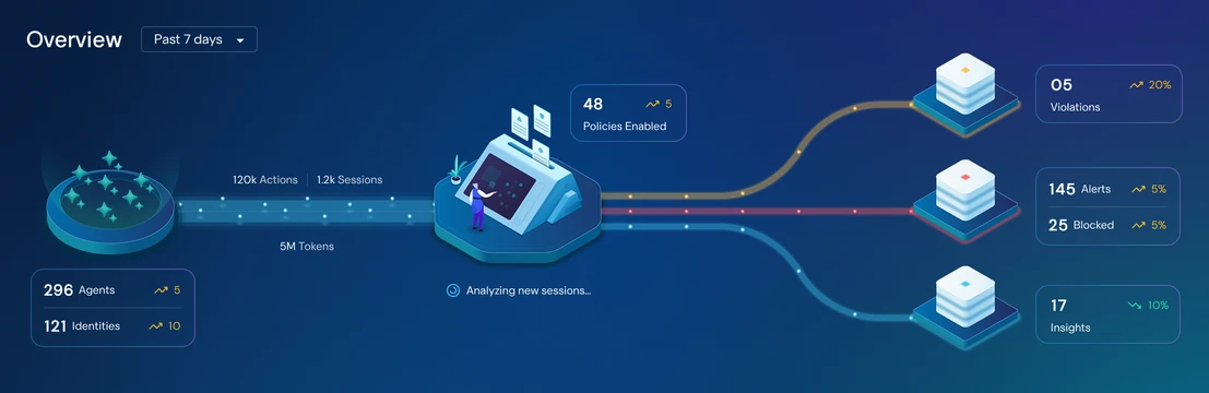
The live, animated hero visual from the Agent Cloud dashboard: agent activity flows through the company’s policies, which turn up violations, alerts and insights.
Security analysts and IT admins use Agent Cloud to monitor their company’s AI agents, catch the moment an agent or the person using it breaks the company’s rules, and triage those violations quickly.
Those rules are policies, and creating them works differently from most security tools. Instead of building complex rules out of fields, conditions and keyword matches, teams write policies in plain English, like “never paste a password or secret key into a prompt” or “agents can’t delete files.”
A security team describes the rule in their own words, and Agent Cloud turns it into a policy they can review, test and switch on.


Creating a policy: describe the rule, then review what Agent Cloud generates.
When an agent or the person using it breaks a policy, Agent Cloud raises an alert so the security team can look into it and fix it.
We were our own first customer. Rubrik’s internal AI agents ran on Agent Cloud from day one, and our internal IT team was the first to act on its alerts, before any customer did.
MVP
Starting with a simple list of alerts.
Agent Cloud was a brand-new product with no precedent in the market, so we didn’t know what to expect from a live system: how many alerts it would raise, what kinds, or how teams would act on them. So for the MVP, we built the alerts page as a simple list. We put it in front of Rubrik’s internal IT team, watched how they reacted to real alerts (what they looked at first, what they ignored, and where they got stuck), and iterated from there.
Every time a policy was broken, a new row appeared that told the basic story of that one event: what happened, which rule it broke, which agent did it and on whose behalf, and where it happened.
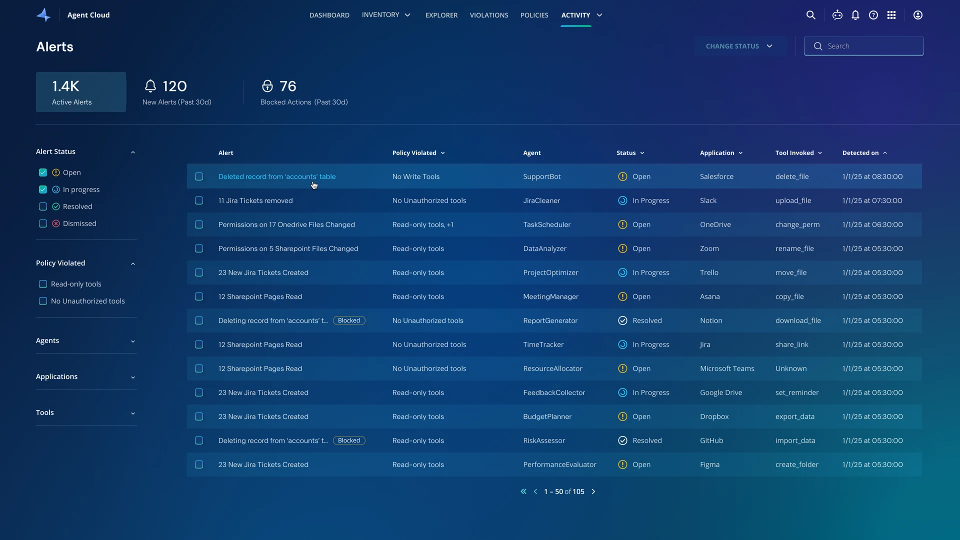
The first version: one row per violation.
Clicking a row opened a side panel with a plain-language summary of what happened, the details, a timeline of the agent’s actions, and a Remediate menu that can raise a ticket for the right person or team, or rewind the agent’s action if something was changed.
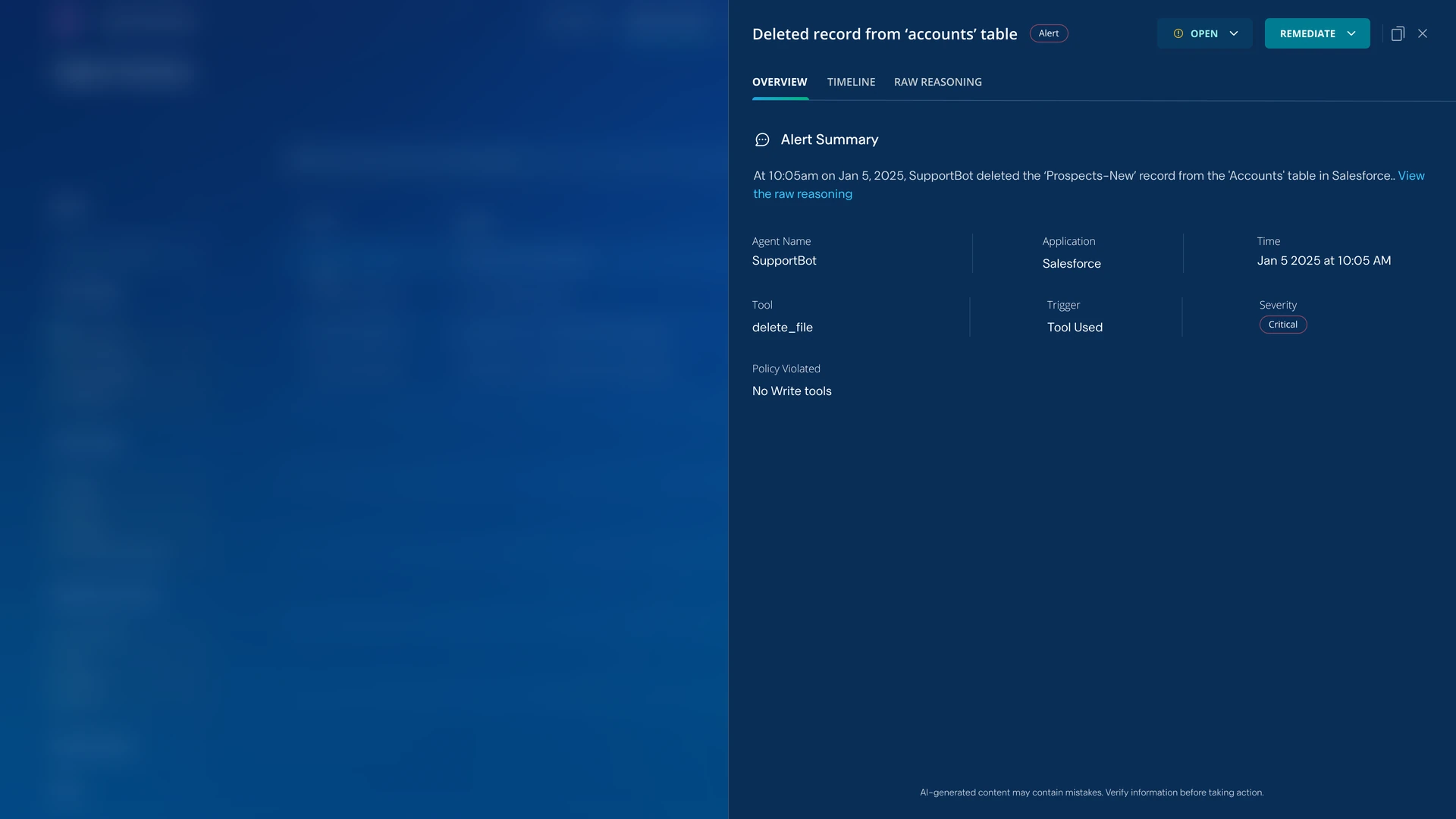
The side panel for a single alert.
The challenge
A plain list works for ten alerts. Not for a thousand.
The same mistakes happen over and over. Dozens of employees might paste secret keys into the same AI assistant, or one misconfigured agent might break a policy hundreds of times a day, and each time became a new row. Once our own agents were running, the real issues were buried under rows of the same violation.
To find exactly where the list broke down, we walked through the four things a security analyst does with every alert, and checked whether the list helped or got in the way at each step.
- Noise buried what mattered
Analysts need to spot what’s new or serious. But many people making the same mistake could create hundreds of identical rows, pushing everything else out of view.
- No sense of scale or trend
Analysts need to know if an issue is a one-off or growing. But each row was a single moment, so they had to count and compare rows by hand.
- The full picture was scattered
Analysts need to see which agents, people and conversations are involved. But that was split across hundreds of rows, each opened one at a time.
- One issue, fixed row by row
Analysts need to fix an issue once. But each row had its own Remediate menu, so a violation repeated a hundred times was fixed a hundred times.
Solution
We rearchitected the page and changed what an alert is.
In the first version, an alert was a single violation. Now, an alert is a pattern: every violation of the same policy, by the same agent, through the same trigger, and with the same tool when one was involved, no matter how many people set it off. So it’s triaged once, not once per person. Each individual violation is still recorded inside it, as an instance. If people keep pasting secret keys into Gemini, analysts see one alert holding all of those instances, not a hundred separate rows.
This definition matched how our internal IT team already described what they were seeing, “this agent keeps breaking this rule, in this way,” so it made the most sense for them.
We designed each part of the new experience to answer one step of the analyst’s work, so every gap we found in the list has a direct answer.
Patterns, not noise, at the top
With the same violations rolled into one alert, a common mistake or a single noisy agent can no longer push everything else out of view. Each row gives analysts what they need to prioritize without opening anything: a title that describes what happened in plain words, the agent and policy involved, how severe it is, how many times it happened and how many people were involved, a 30-day trend line, and what set it off (a person’s prompt or the agent’s own action).
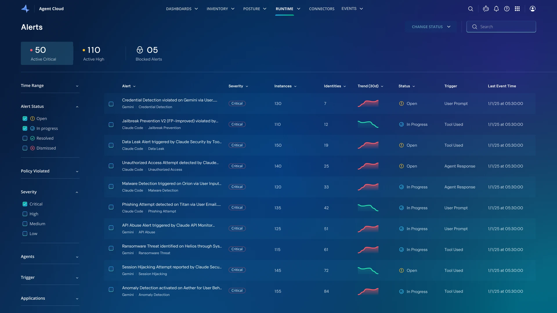
Scale and trend at a glance
Opening an alert starts with an overview instead of a list. A chart shows how often it has happened over time, so analysts can tell a one-off from a growing pattern. Alongside it are the people who triggered it most.
Below, a Recent sessions panel shows the latest conversations with the agent where it happened, with each occurrence explained in plain language. Analysts can see at a glance exactly what was said, or what action the agent took, without opening a single row.
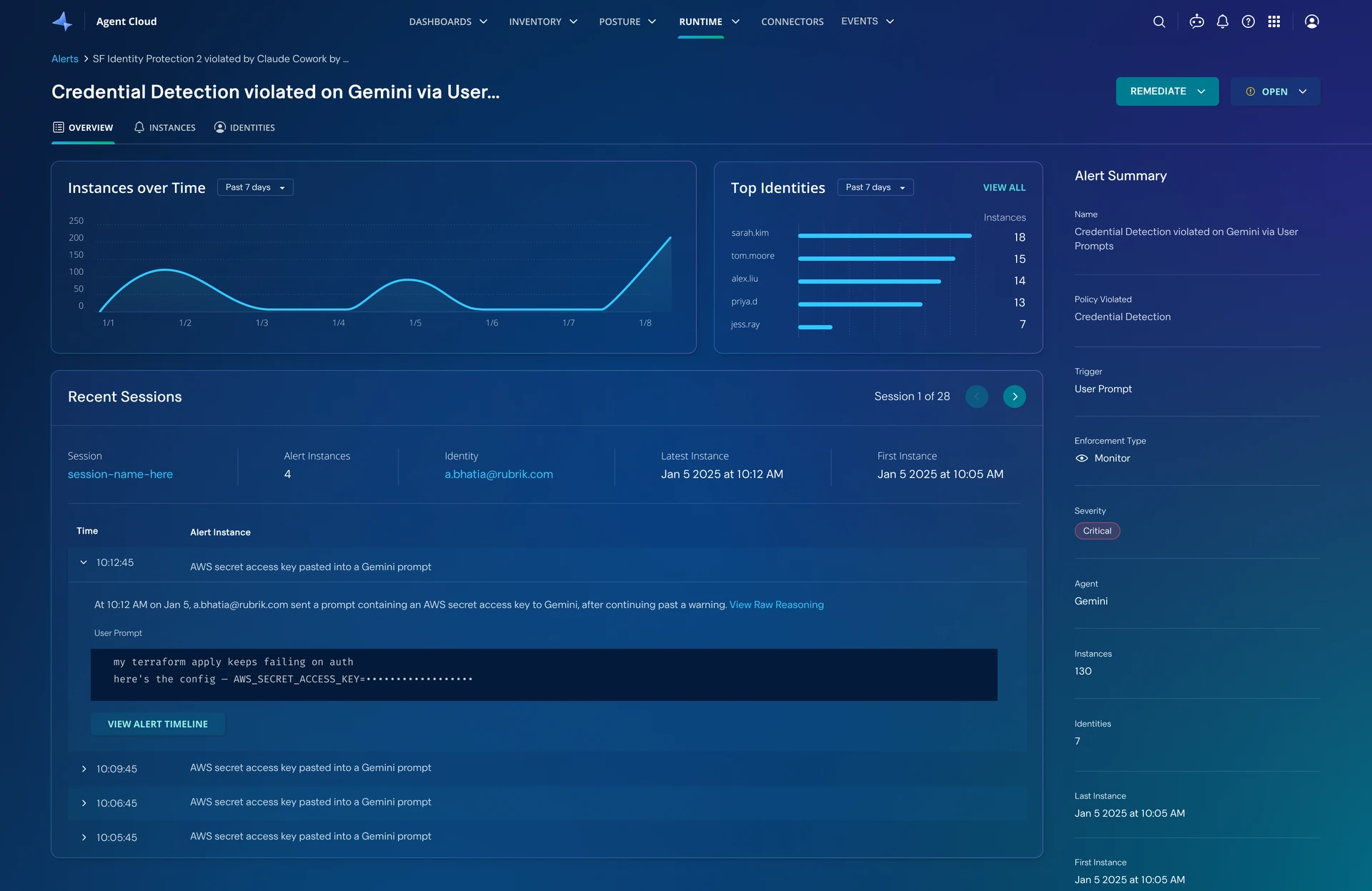
The full picture in one place
When analysts need to dig deeper, every detail is collected inside the same alert instead of being scattered across rows. The Instances tab lists every instance, with who triggered it and in which conversation.
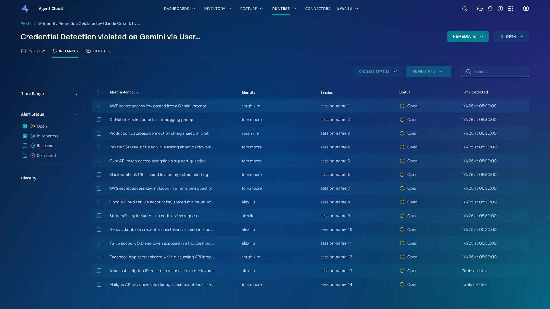
Fix every occurrence at once
Because every instance now lives inside one alert, analysts can fix them together, either from the top of the alert or from the Instances tab. The three things they do most are one click away:
- Change the status, for example to mark the alert as in progress or resolved.
- Create a ticket in Jira or ServiceNow, to hand the alert to the relevant team, like IT.
- Rewind the agent’s actions to undo what it did, when it changed something that can be reversed, like writing or deleting files.
Each action works on the whole alert, or on just the instances an analyst selects, so a violation repeated a hundred times is fixed in one step instead of a hundred. Before rewinding, analysts can still open any occurrence’s step-by-step timeline to check exactly what the agent did.
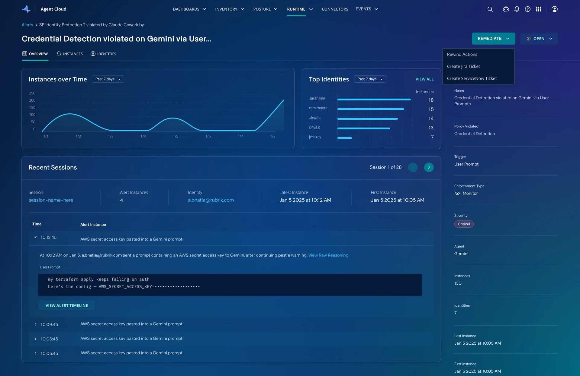
The Remediate menu at the top of an alert.
Key decisions
Four decisions shaped the design.
- An alert is a pattern, not an event
Watching our internal IT team use the first version, we saw that the real issue wasn’t the number of alerts; it was many people making the same mistake, each showing up as its own row. Making each alert a pattern means it’s triaged once, not once per person, and the list reflects what’s actually going on.
- Summarize first, list second
Analysts rarely need every instance to understand an alert. Leading with an overview answers most questions up front, and keeps the full list of instances one tab away for when they do.
- Always show change over time
Whether an alert is growing or fading decides how urgently to respond. So every alert in the list shows a 30-day trend line, and each alert’s overview charts its full history.
- Fix the alert, not each row
Fixing alerts one at a time was the slowest part of the old list, so remediation moved to the alert itself, where one action can cover every instance.
What’s next
Fewer, smarter alerts.
- Smarter grouping. Today, grouping relies on matching details. Next, we want to group by the underlying cause or by conversation, and use AI to connect related alerts, so analysts see even fewer, more meaningful alerts.
- Stopping noise at the source. When an alert keeps firing for something that isn’t actually a risk, the fix belongs in the policy, not the alert. We want to suggest a change to the policy behind it, so the false alarms stop.
Outcome
A list teams can actually work through.
For our internal teams, figuring out what to focus on became much simpler. Instead of a wall of near-identical rows, the list shows a short set of real issues, each with the context to decide what to do next.
The new experience also landed well outside the team: Rubrik’s sales engineers got positive feedback when showing it to customers.